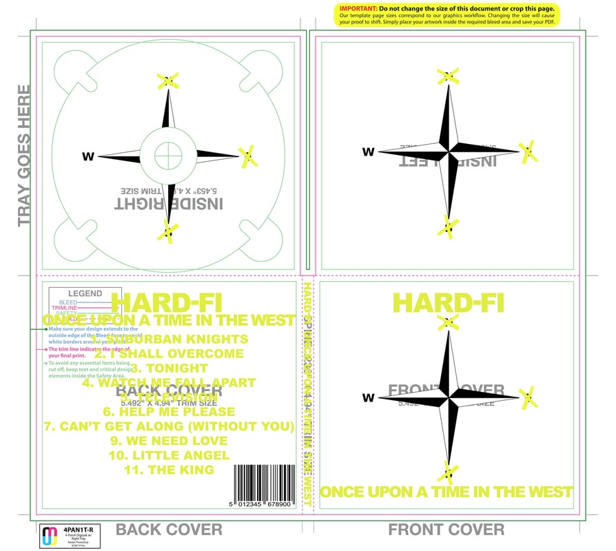
 Today I finalized the album cover re-design for HARD-FI: Once upon a time in the west. In the end not much changed from my rough sketches. I think the Yellow on white looks significantly better than their usual yellow on black. The funny thing is that their album cover in Japan is yellow on white, much like the one I designed. I think it would have looked significantly better in their western releases if they had used less black in their album covers.
0 Comments
 Today i created a logo for the Castro Valley Black Student Union (BSU). I took the classic design of a fist and molded into the letters BSU CV. I colored it in the popular colors for Black student unions: red, green, yellow, and black. I am very proud of how this came out. It could always be better, but the concept is wonderful.
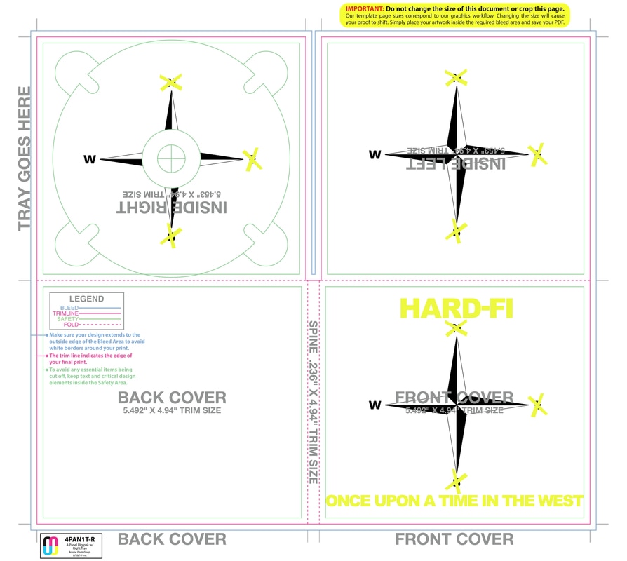 Today I nearly finished my album cover redesign for HARD-FI's album Once upon a time in the West. My inspiration was their love for simplistic album covers, the exclusive use of white, black, yellow, and their first album cover. Their first album was named Stars of CCTV and showed a CCTV camera in their signature colors. I used that style to create a compass rose that only tells you how to go west. I am very proud of how it is turing out, but looking at it from a distance, I will choose a darker shade of yellow from now on.
|
