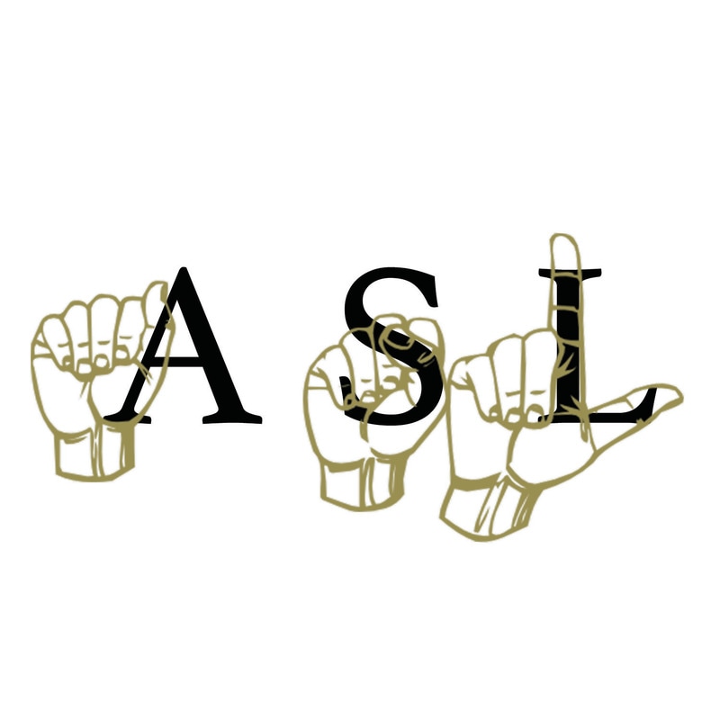
 Today I designed a logo for the ASL class. I used the sign language signs for ASL and matched them up to the letters. I used 2 filters on the hands: a color overlay to make them look more human and a very slight outline to make them more visible. The outline helps a lot in making the hands and the letters behind them both easily visible at the same time.
0 Comments
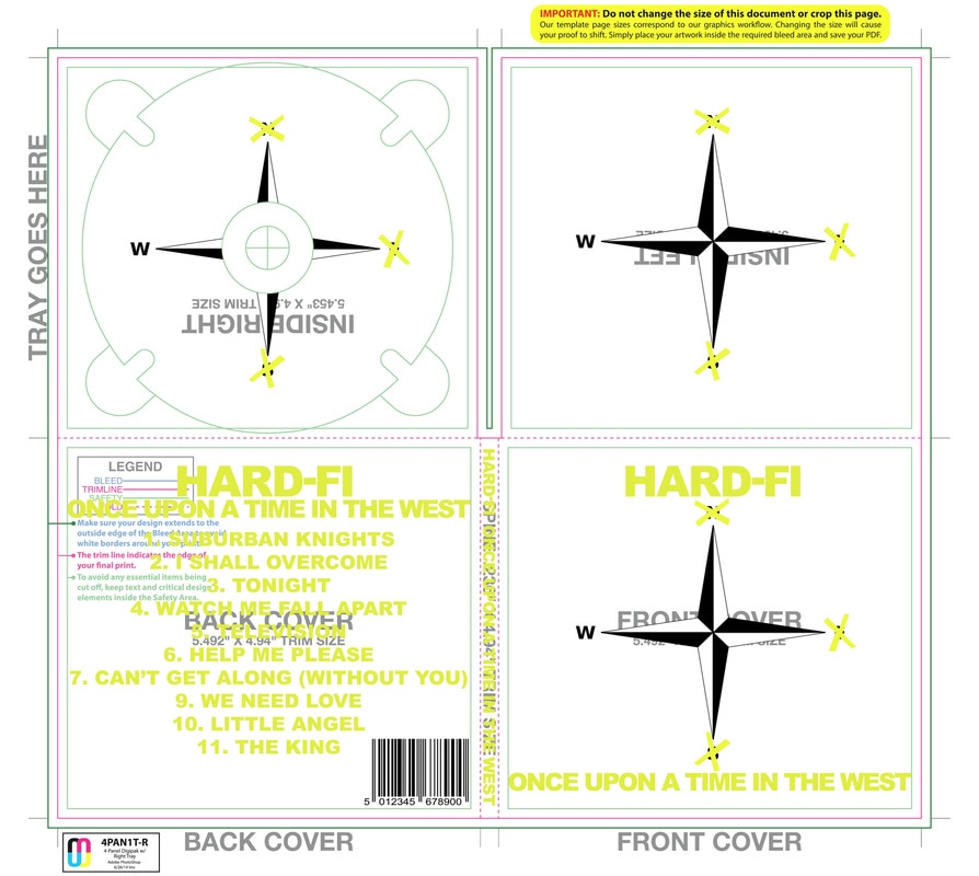 Today I finalized the album cover re-design for HARD-FI: Once upon a time in the west. In the end not much changed from my rough sketches. I think the Yellow on white looks significantly better than their usual yellow on black. The funny thing is that their album cover in Japan is yellow on white, much like the one I designed. I think it would have looked significantly better in their western releases if they had used less black in their album covers.
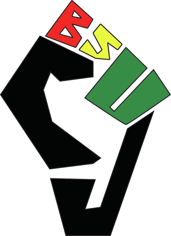 Today i created a logo for the Castro Valley Black Student Union (BSU). I took the classic design of a fist and molded into the letters BSU CV. I colored it in the popular colors for Black student unions: red, green, yellow, and black. I am very proud of how this came out. It could always be better, but the concept is wonderful.
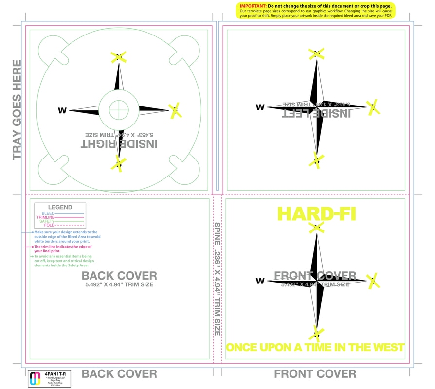 Today I nearly finished my album cover redesign for HARD-FI's album Once upon a time in the West. My inspiration was their love for simplistic album covers, the exclusive use of white, black, yellow, and their first album cover. Their first album was named Stars of CCTV and showed a CCTV camera in their signature colors. I used that style to create a compass rose that only tells you how to go west. I am very proud of how it is turing out, but looking at it from a distance, I will choose a darker shade of yellow from now on.
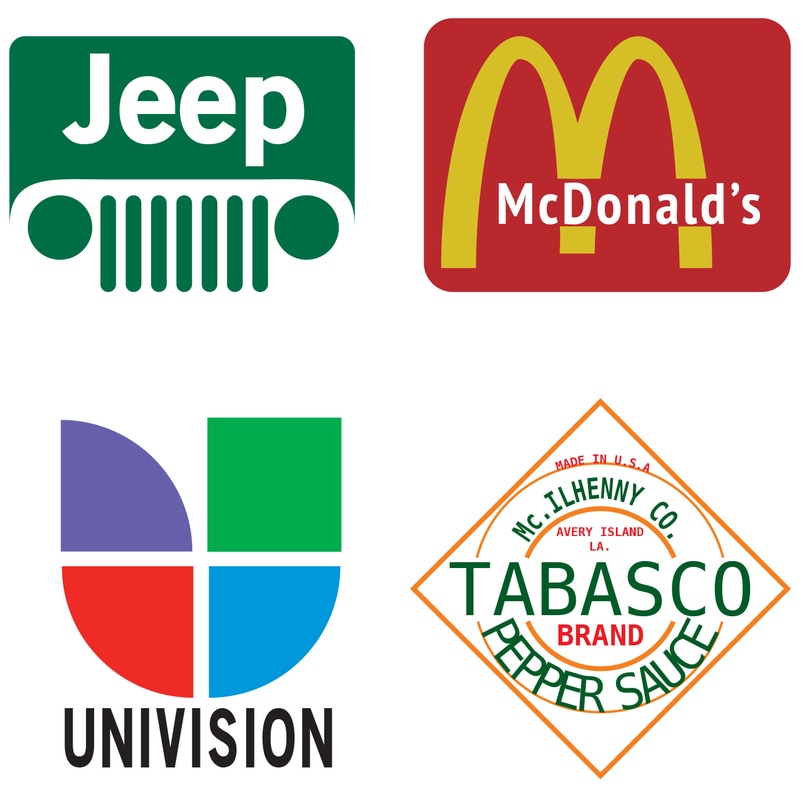 Yesterday and Today in class I worked on making these logo replicas. I made these all in Adobe Illustrator only, only using the originals as reference pictures. I am very pleased with how they came out. The UNIVISION and McDonalds ones are great. I am surprised at how well the golden arches came out. The JEEP one is good, but noticeably wrong. The TABASCO one is decent, and it would take a long time to improve. Creating perfectly curved text is very hard to do.
Today we spent some time out of the classroom researching font families. We went around and got pictures of various fonts around the campus. Then I labeled them with their font families. Soon we will have to make our own font family book. This project was a lot of fun, and I learned a surprising amount from it. I've never looked around the campus and really payed attention to the various fonts in use. For example, i've never noticed how good looking the font they used for the Trojans logo is. I really like slab serif fonts when they are used correctly. 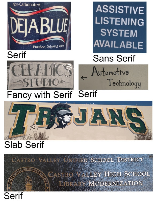 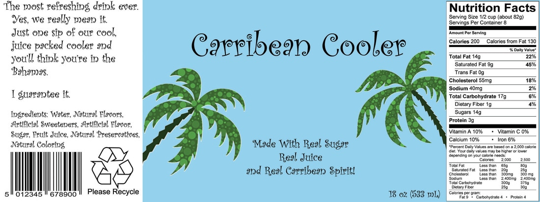 Today i finished my drink label, as seen above. I had a lot of fun on this project. The best part was learning how to use layer masks with many layers. For example, the palm trees above were part of a bigger picture, but I had to mask them out and then resize them to fit the label correctly. Overall, i am very happy with the final project.
Today was our first work day on Drink Label creation. We need to make a realistic drink label for a fictitious drink. My idea is Carribean Cooler, a cool natural juice drink. I got the basic design ready, and i will add to it over the next couple of days. 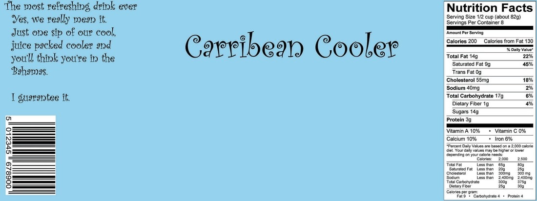 Today in class I finished my 3 text filter assignments. My favorite is the America one, but the most work was the Magma one, due to the difficulty of simplicity. Finding the right font and filters was very hard.
Today in class we worked on making custom words where the text looks like the word would. For example, Cookie, but it's made out of cookie dough, with chocolate chips and texture and all. It is really hard to do on your own. Finding the right font on its own is hard to do: for example, if I wanted to do one for Magma, I would want a font with flowing letters yet is still a little bit sinister looking. Finding fonts to fit your needs really takes time.
After that, it is just a matter of using layers to your advantage. While you may not know what your doing at the start, once you look around for an adjustment layer and a texture filter, you'll find some stuff that works just right. From there, you just need to add one or two more more bits to it and maybe customize one of the letters, and you're done. It sure does take time though. |
